
A product that looks
desirable — and clear.
With a product brand, the product has to look desirable and the route to an order has to be clear.
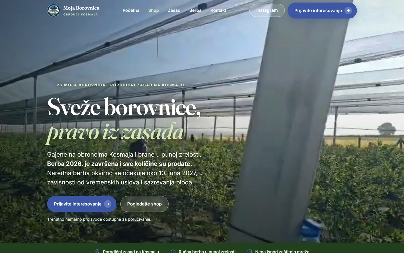
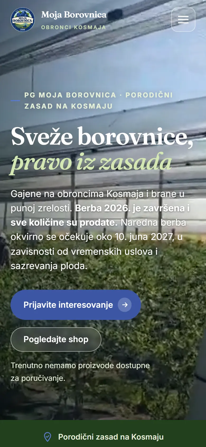
A screenshot of the live address, 20 August 2026. Not a composite and not a mock-up.
The brief, and what was done
The brief
- That the product looks desirable and is clearly explained
- That the photographs and the copy lead to an order
- That the brand comes across as tidy and serious
What was done
- A catalogue of 16 items, arranged by category
- Product photography brought to the front
- A video presentation of the brand
- Contact details and an enquiry form with several ways to get in touch
- Built for the phone
Why this way.
Put the product and the photograph ahead of everything else.
Keep the message short and specific.
Build the page so content can be added to it easily.
No online payment and no checkout; orders go through an enquiry. Items marked “Coming soon” are not yet part of the current range.
Nemanja Čulić · Moja BorovnicaWorking with Nenad on the Moja Borovnica website was very straightforward and pleasant. He understood what we wanted to present, gave us useful suggestions, and turned it all into a modern, clear and functional site.
It mattered to us in particular that visitors could easily find information about our blueberries, how we grow them and how to order — and now it is all clearly presented and works on a phone as well. We are more than happy with the final result and with the whole collaboration.
The client’s own words, published with his consent. Translated from Serbian. No stars, no score and no aggregate rating.
What the job involved.
More work and more to read.
Have a product that looks
better in person?
Photography and a clear structure do most of the work for a product brand. Send us a couple of sentences about what you make.